


Posts Tagged ‘Landscape Photography’
Story-Review-Gallery Combo
Story
Thank heavens we’re not ‘fanboys’ and thank heavens we don’t do reviews anyway! DPReview has a short story about bogus online reviews that ‘dis’ one or another product. These fake reviews are attributed to fanboys gone bad. This news story is actually based on a bona fide academic study, Deceptive Reviews: The Influential Tail (40 pages) by Eric Anderson and Duncan Simester.
It’s an open secret that some small-time brands and sellers purchase review writers’ ‘services.’ Anderson and Simester have uncovered a dual reverse phenomenon: some self-appointed reviewers post negative reviews . . . gratis!
Briefly, the authors began with a set of reviews that were known to be genuine and another set that was known to be fake. They used syntactic and linguistic analysis over these different sets to determine whether any patterns could be found, and voila! These findings allow one to infer which review has a good chance of being a fake.
Electoral candidates well know the value of negative advertising during elections. Clearly, some ‘fanboys’ are learning well from them.
Review
Having written what we have above, we’d better not sound negative about the Samsung Galaxy S4. Fortunately, all we’re doing is concisely presenting what Daniel Bell has to say on ePHOTOzine about this android gadget.
This 13 MP smartphone camera has Full HD video and goodies like Panorama and HDR modes. Notably, it has an AMOLED display – a Samsung-LG innovation from last year.
Image quality in all its facets is not something to get too excited about; then again, there’s nothing particularly poor about it. Bell politely uses the word ‘good’ throughout this part of his review.
It edges the iPhone 5 on one score: high-res panoramas but in portraits it’s “not ideal” – they “aren’t great.” Bell awards the Galaxy S4 two 3-1/2 stars and two 4 stars in ePHOTOzine’s four essential review criteria.
Gallery
Masters of Vision is a British biennale that is due to open next month to “showcase the work of legendary master landscape photographer Joe Cornish and eight other inspirational UK landscape photographers,” reports Photography Blog.
Judging from the images on the website’s main page this exhibition is much about Ethereal Nature.
In truth this gallery is deserving of a full-length post, comprising as it does of some of the finest work of some of the country’s finest photographic artists.
Take, for instance, Joe Cornish’s incredibly captured ‘God Beams’ bathing a hilly Northern landscape, making for an image that is quite transfixing. Or David Baker’s minimalistic study of sky, waves and spume, radiating both beauty and menace.
Come to think of it, with the amazing variety and sheer number of gorgeous photographs in this gallery, why not dedicate a post exclusively to it . . . .
If this Story-Review-Gallery combo doesn’t do it for you, head over to today’s equivalent on our sister blog!
Tutorials: Far Out and *Also* ‘Far Out’ . . .

English: Ansel Adams The Tetons and the Snake River (1942) Grand Teton National Park, Wyoming. National Archives and Records Administration, Records of the National Park Service. (79-AAG-1) Français : Ansel Adams. Les Grands Tetons et la rivière Snake (1942). Parc National des Grands Tetons, Wyoming. Archives Nationales des USA, Archives du service des parcs nationaux. (Photo credit: Wikipedia)
We take in two tutorials at the ‘long’ and ‘short’ end of the lens today. One has to do with Landscape Photography and the other with close-in Macro Photography!
From Far Out . . .
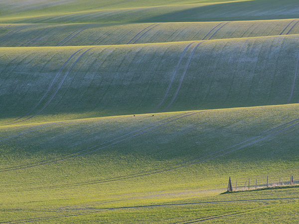
Elliot Hook’s Landscape Photography tutorial in DPSchool addresses the question Where to Position that Horizon? Hook relates the ‘rules’ and also explicates just when and where to break the rules. The ‘rules’ for high and low horizon explained, Hook shows when and where to go for a centred horizon.
He also says that you can entirely omit the sky if the landscape itself has sufficient interest and detail, illustrating the point with a picture of a textured, undulating meadow. Actually, waterfalls and cascades are an excellent example of scenes in which one can omit the horizon.
Aspect ratio has a little something to do with horizon positioning as well. A panoramic landscape will generally look best with a horizon that is off-centre but not dramatically so. A vertically-oriented composition, however, will benefit from horizons that are well off centre, close to the top of the frame. Also, assuming that the subject-matter is complementary, 1:1 aspect ratios and centred horizons go very well together as the symmetries reinforce one another.
Vantage point and angle of elevation will also influence the placement of horizon.
Also ‘Far Out’ – in a Different Sense
How about photographing a landscape reflected in a water drop? That’s the technique you can learn in Harold Davis’s how-to, Photographing Waterdrops: Exploring Macro Worlds, published on Shutterbug.
Davis has a philosophy around photographing waterdrops; he says that having a “visual structure” and “metaphorical stage” is important if you want to create an image such as this soothing semi-abstract photo. Fortunately, you do not have to go that far because he also provides some more nuts-and-bolts type of guidance.
To begin with, he explains why it’s a good idea to use macro flashes and what their effects are. However, he also provides tips on how to photograph sunbursts in a drop – and that can only be done with natural lighting.
Davis’s text relays which weather conditions provide the best opportunities for photographing waterdrops. You can also learn a few tricks from the detailed exposure information provided with each image
If you’re psyched for this kind of photography but only find a ‘blah’ droplet on a ‘blah’ setting, add one or another type of diffraction filter to your lens and see what it does!

The American Wilderness in Monochrome
A group of photography ‘experts’ tends to look down on colour as they consider black-and-white as the ‘proppah’ medium for photographic art. What would they say about images that are neither colour nor black-and-white but both: monochrome prints?
They just might say, “Oh Wow!” if they see stunners like this gorgeous composition in shades of violet and purple, and that would be apropos because “OHWOW” is also the name of the Los Angeles gallery where these photographs are being exhibited.
“Wonderful Land” is the title of the exhibition and the photographer is David Benjamin Sherry. His large-sized monochrome prints of the American wilderness bring a new ‘colour’ to the genre of Landscape Photography. (They are chromogenic prints; chromogenic printing is a type of process.)
One reason for Sherry’s presentation is suggested by Dan Abbe in his photo article in American Photo. “Given the work of photographers in Group f/64,” Abbe says, “it may be that there’s no longer any meaning to go out and photograph the same subjects using the same black and white process.” Hence, the “strange hues” and “unexpected colors.”
As with black-and-white, in these tinted monochrome prints the lines, form and structure of the image engage the eye, the so-called ‘distraction’ of colours being eliminated. At the same time seeing a monochrome print in shades of a hue, often a saturated hue, is a refreshing change in the manner in which a photograph ‘hits’ us. Sherry’s technique works very well with Landscape Photography whereas it would seem downright contrived – even weird – when applied in other areas, say Wildlife Photography.
While one or two photographs simply substitute shades of a hue instead of shades of grey resulting in what is essentially a tinted print, in others the tint is so spot-on with the landscape and its elements that a hypnotizing, otherworldly atmosphere is generated. In still others the subject and choice of hue and dynamic range combine to produce an abstract form.
These large-format images are presented as fairly large prints; most measure about nine square feet. The sheer size would heighten the intensity of these spectacular renditions of the western wilderness for those fortunate enough to see them in L.A.
Beyond HDR: Deschaumes’s ‘Extreme Landscapes’
First, there was dodging and burning. Then, there was Ansel Adams. Then came HDR. And now we have Extreme Landscape Photography and Alexandre Deschaumes. Not only that, but Deschaumes does it the natural way and the hard way, setting out for remote and inaccessible places and bringing back photographs that take on the quality of moody paintings and even dreams.
Deschaumes has two sets of online portfolios, one on SmugMug and the other on 500px. As you will find, a few of the images are like both, moody paintings and dreams.
Check out Opalescent Dream for a very different kind of mood (than the image linked to above); these photographs would have made ideal backdrops for a few scenes of the LOTR movies. This gallery has to be seen for some of the most delicate hues and textures in landscape photography.
Here is a radically different ‘evocation’ of the same subject matter, brilliantly composed. In that same gallery is this spellbinding image of a mountaintop lake which truly defines ‘Extreme Landscape Photography’.
What we find all too easy to do with rivers and stars must be a little complicated where clouds are concerned, i.e. long exposures. Look at these ribbony tendrils Deschaumes has produced while the same technique also yields a more dramatic, minimalist and stark image.
Without any doubt this photographer is a master technician who has his own secrets and creates his own magic, including – of course – via post-processing techniques. At the same time he is an artist in the true sense of the word. That much-bandied word, ‘Vision’, is something that Deschaumes clearly has in spades. Even if you or I made it out to the same godforsaken place, would we have been able to produce this image? Or this one? That’s ‘Vision’.
As strange as it sounds, a few of Deschaumes mountain photographs resemble some of Rembrandt’s portraits with respect to lighting. Here is chiaroscuro effect, montane style. You can see more examples of mountain photos a la Rembrandt, so to speak, on this page.
What has been summarized here is but a drop in the ‘Photobucket’ of a single photographer who has been shooting for only ten years!
Landscape Photography and Aspect Ratios
So many ‘rules’ and guidelines govern photography, including landscape photography. However, the all-important choice of aspect ratio ‘enters the picture’ as only an afterthought during post-processing. Instead, the aspect ratio ought to visualized at the time of taking the photograph in order to maximize your chances of nailing an appealing landscape. That is Elliot Hook’s premise in Aspect Ratios in Landscape Photography.
From this position, Hook proceeds to take the reader through generally-accepted aspect ratios. He explains the effects each has upon the eye and perception and also what the strengths are of each.
Note that Hook’s tutorial is about “Landscape Photography.” As such, aspect ratiosthat are higher than they are wider (what you get by turning the camera 90 degrees) ar

Aspect ratios (Photo credit: Wikipedia)
not discussed in any detail but are mentioned at the end. That doesn’t mean you cannot or should not use a portrait orientation for a landscape. A minority of situations in landscape photography – e.g. cliffs, gorges, waterfalls – lend themselves to a portrait orientation. Pronounced vertical aspect ratios can heighten dramatic impact.
Starting with a 1:1 ratio – a square – Hook says that it can be used to “give a subject a striking presence at the centre of the frame” and that it “lends a good opportunity to break the rules we so often follow.” Simply trying out Hook’s recommendations will easily prove their worth.
Hook differentiates between different ‘landscape format’ aspect ratios. He says that relatively narrower ones, like 4:3, are useful when wants to lead the eye from the foreground to the landscape itself. In contrast, wider aspect ratios like 16:9 (and even wider) invite the eye to travel horizontally – ‘sweep’ the image. They are best used to represent a ‘pure’ landscape; a distant scenic panoramic view.
Another element is also in the mix: focal length. Hook associates each aspect ratio not only with what photographic material it will work best for, but also with suitable and appropriate focal lengths. For instance, he suggests using “longer focal lengths” for images with a 16:9 aspect ratio. This article provides many similar guidelines.


 Follow us on Facebook for all the latest in canvas printing news and exclusive deals!
